
The Design Anatomy of Hand-Styles
Intro
Graffiti has always started with a tag. A quick scrawl on a wall, a name repeated until it becomes a signature. Over time, those hand-styles didn’t just mark territory they shaped the visual language of street culture. What began as raw, improvised letterforms now inspires typefaces, branding, and even global design trends.
In this blog, we’ll break down the anatomy of hand-styles: how tags evolve into typefaces, the rules behind the chaos, and why this matters to design, fashion, and even home décor. Along the way, we’ll show how Geko draws on those same principles to translate graffiti into art you can live with.
The Birth of the Tag
Every graffiti writer starts with one thing: a tag. It’s a name, a marker, a claim. The goal is speed, repetition, and recognition. Early tags in New York subway tunnels or London underpasses weren’t about perfect lettering they were about presence.
These fast scrawls might look random, but they’re not. Writers experiment with stroke weight, rhythm, and flow until their tag feels unmistakable. That’s the foundation of hand-style culture: identity written over and over until it becomes muscle memory.
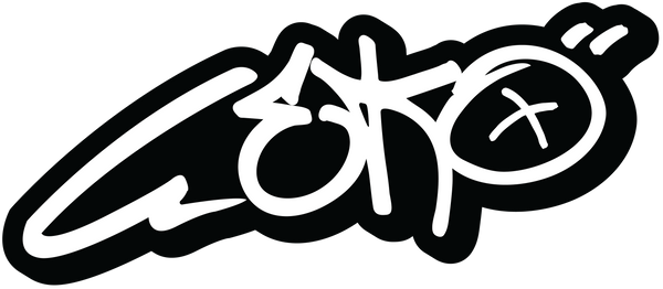
Anatomy of a Hand-Style
Hand-styles are more than scribbles. They’re designed with intent. Look closer and you’ll find:
- Flow: letters connect in rhythm, like bars in a verse.
- Weight: thick and thin lines create motion.
- Balance: tilted letters or exaggerated flourishes create visual impact.
Writers often describe hand-styles in musical terms smooth, bouncy, sharp. Once you know what to look for, you’ll see the design logic hidden inside the freestyle.
Regional Styles: From Philly to LA
Just like accents in speech, graffiti hand-styles change with geography. Philly tags are tall and vertical, with elongated letters. LA styles are wide, often using chisel-tip markers for bold lines. New York classics focus on rhythm and flow, the blueprint for many modern scripts.
Regional hand-styles matter because they influence how typefaces are built today. When you see a graffiti-inspired font online, chances are it’s borrowing cues from one of these regional styles.
From Tag to Throw-Up
Tags are the foundation, but the next step in hand-style evolution is the throw-up. Bigger, bubble-lettered, faster to fill in. While tags are personal, throw-ups are about visibility. They show how letterform can stretch, bend, and morph while still being readable design principles used in typeface creation today.

Graffiti Meets Typography
When designers began digitising graffiti, they weren’t just copying letters they were studying them. Hand-styles became reference points for typefaces that carry graffiti’s energy into graphic design, advertising, and branding.
From bold marker fonts to dripping script styles, graffiti taught typography to loosen up, to embrace irregularity, and to value expression over perfection. That’s why so many brands today use graffiti-inspired fonts to feel authentic, raw, and connected to youth culture.
Tools of the Trade: Pens, Mops, and Sprays
Hand styles don’t just come from the hand, they come from the tools.
- Markers: smooth, controlled lines.
- Mops: fat, dripping strokes.
- Spray paint: fast, unpredictable flow.
Each tool forces a different design decision. A fat marker makes wide, flat letters. A spray can’s pressure creates variation in weight. These tool-driven quirks are what give graffiti its iconic look, and why designers often mimic them in digital typefaces.
Rules of Legibility (and Breaking Them)
Every tag plays a balancing act between legibility and style. Some writers prioritise readability; others push distortion until letters are almost cryptic. The more you learn to “read” hand-styles, the more you see the design intelligence behind them.
This tension between clarity and chaos is exactly why graffiti lettering has inspired type designers. It teaches them that letters don’t have to be rigid grids. They can dance.
Influence on Fashion and Streetwear
Streetwear brands borrow heavily from hand-styles. Think of tees with oversized script logos, hoodies with dripping text, or hats with marker-style tags. These aren’t accidents they’re direct translations of graffiti lettering into wearable typefaces.
By wearing graffiti-inspired lettering, you’re not just wearing words you’re wearing culture. It’s design turned lifestyle.
Influence on Home Décor
Graffiti lettering isn’t just for clothes or walls it’s creeping into interiors. From posters with bold hand-styles to canvases featuring lettering as texture, typography itself becomes décor.
Having graffiti-inspired art in your home is like hanging a piece of design history a reminder that typefaces don’t just come from studios, but from the streets.
Digital Futures: Graffiti Fonts Online
Today, entire libraries of graffiti fonts exist. Some are authentic, digitised directly from writers; others are inspired interpretations. These fonts keep graffiti’s hand-style energy alive in digital spaces from album covers to Instagram graphics.
The risk? Losing the rawness. The challenge for designers is to keep that unpredictability alive in a medium that craves perfection.
Conclusion
From the first subway tags to today’s graffiti fonts, hand-styles have reshaped how we think about lettering. They’re proof that design doesn’t just belong to studios it belongs to the streets, too.
For Geko, these principles aren’t just theory they’re practice. Every canvas, print, or object we create draws on hand-style energy, balancing chaos and control. Whether you’re wearing it, hanging it, or studying it, graffiti lettering connects you to a culture that redefined design.


